Blog
July Fully Covered: Outdoor Innovation Meets Summer Fun
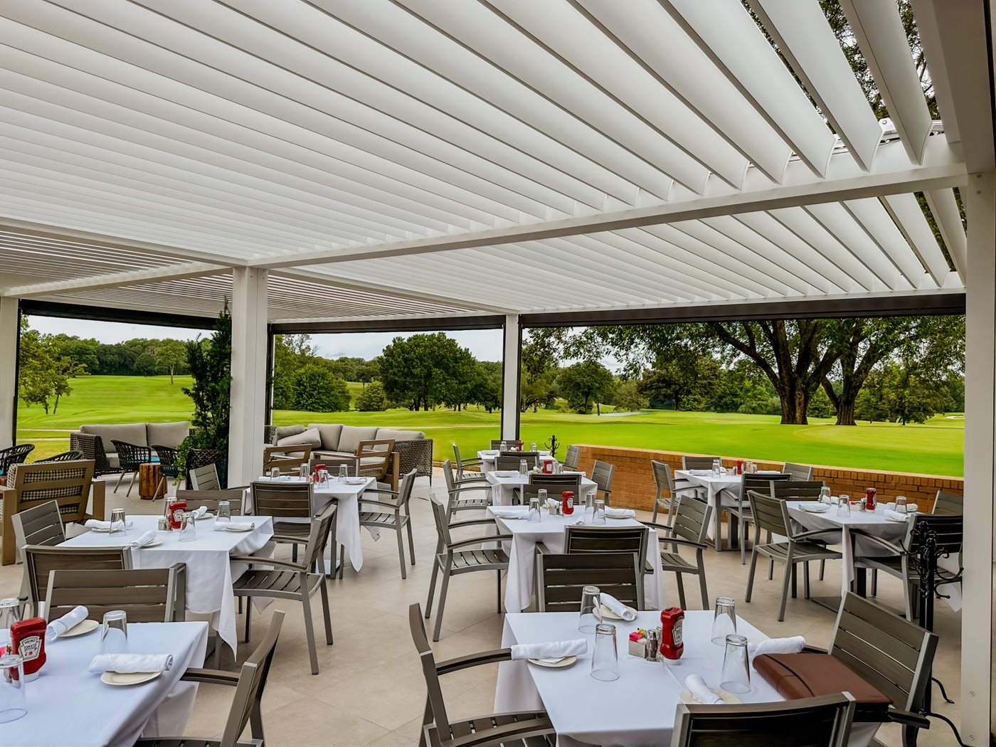
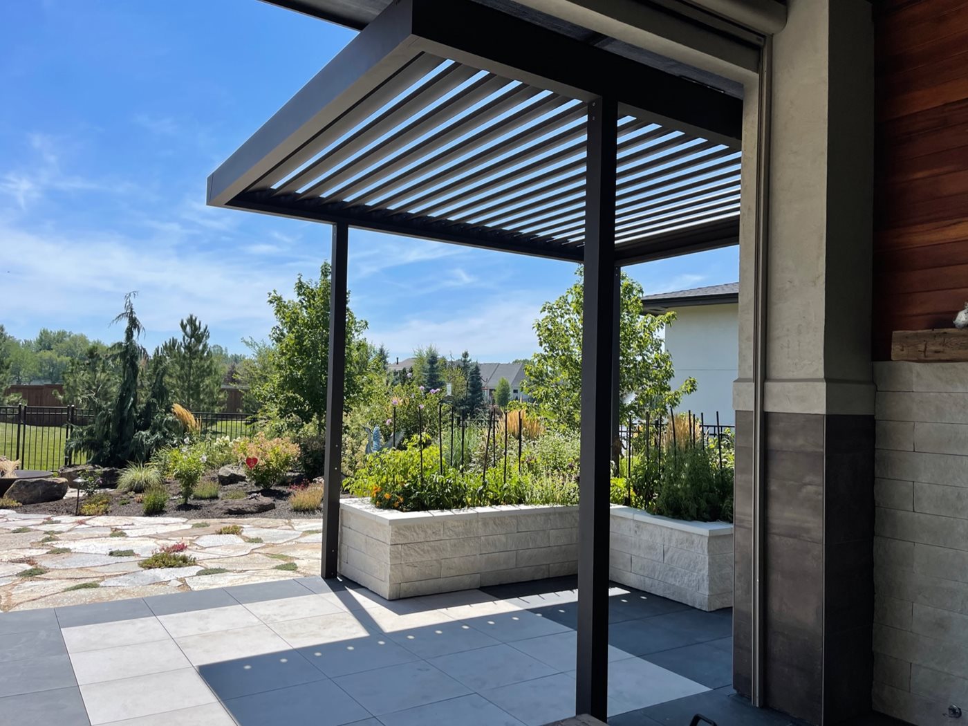
With longer days and warmer evenings, July offers plenty of opportunities to enjoy your outdoor space. Below, you’ll find seasonal moments and event ideas that pair seamlessly with our shading solutions, each one designed to enhance comfort and style.